Tuesday, December 15, 2009

Technology First, Needs Last

I'm reading a new essay by Don Norman with this same title at and it makes me think.

For some reason the conclusions look rather evident to me.

Not being a design researcher, my opinions are simply opinions. But having spent many years alive, especially doing high usability software systems, my opinions might have some value.

On the relationship of technology and humans

It is very uncommon that somebody invented something that is completely out of sync with its epoch, may be Babbage did. Or it happens but silently, and so it falls into oblivion. Like the push Internet technologies of the late nineties, "invented" for the convenience of advertising instead of being requested by the people.

Usually there is an unsaid request from the Society for "something", a request that the inventor "hears" in the silence of his mind.

These requests happen in a context, especially a technological context that makes them feasible.

From Don Norman's list of "powerful inventions" I choose the cellphone as an example. Notice that the regular POTS telephone and the radio are above in the same list. The cellphone is a mashup of telephone and radio. In the meanwhile various intermediate devices existed, like citizen's band radio, pulse-code modulation phone lines, and wireless links in rural areas. All these technologies worked but none was so massively adopted as the cellphone, does this makes them less "inventions"?

What make the cellphone such a great breakthrough was not the invention itself but it's huge adoption. The same can be said of the Internet. And by sure of the original telephone.

Actually I could be saying that somehow all inventions are, in fact, just applications of prior inventions.

The same happens with science

Every now and then a pair of hard-working mathematicians assign themelves the merit of having created something.

This is not by chance, at least not completely. Both thinkers were "hearing" the society's silent request.

Less casual was the simultaneous isolation of the HIV by two research teams, one in USA and the other in France. The society's silent request was deafening then.

Role of design researchers

Design researchers are not inventors. Should we browse the patents held by one great design guru like Don Norman and I imagine that we would not find but small steps aimed at perfection. But not completely new devices. The "incremental" kind of invention.

The Design Researchers breaktrough is in way they influence the mind of people. The book "The Design of Everyday Things" helped many people to realize what was wrong with the operation of doors and computer systems and everything else and helped them change their minds.

It is great that Don Norman wrote it. But if he wouldn't then by sure somebody else would have raised the flag.

There was, for example, Mitchell Kapor's "Software Manifesto" published a couple years after DOET.

The society was somehow expecting the "... Everyday Things" book to be written. When it actually happened we read it and feel that it "interpreted our thinking". We are never completely surprised by the ideas of such "hinge" books. To me it was sort of a "déjà vu", and may be to many other professionals that were expecting their feelings to become ideas.

Macintosh & MS-DOS

Now that you mention it, yes, in the eighties there was a desesperate requiremente for "something" to make the newly created PCs usable. This was another deafening silent request.

Such was the need that the Society was ready to settle for anything, just anything. Thus DOS and later Windows: the real innovators were not listening and the opportunity was seized by somebody else.

Getting to the point

The inventors somehow recreate what the Society asks them to invent. They do not invent in the vacuum.

The Design Researchers are a breed of emergents from the Society that tell that Society what are the needs of their members. Their mission is to hear the silent request.

Great inventions are backed by massive adoption, that is what makes those great inventions great.

Google

Can we think of Google as inventors?

Yes, because the Company has that 80-20 rule for personal projects.

And also because many Google projects do not blossom.

The great invention was the search ranking method and its implementation.

The other great invention by Google that I like very much is Gmail, an email system that combines the advantages of the desktop email (which we already forgot) and those of the webmail. This one is great because it contributes so much to make the people's life better.

Other "inventions" like Google Maps are not actually inventions but better implementations of existing ideas and thus do not qualify as "inventions" ... don't thay? Actually every invention is a new view of something that already existed.

Monday, November 30, 2009

Google failures

There has been some recent blogging about Google failures, like in Google’s Past Failures Offer Perspective on Chrome OS Release. There seems to be a list of failures that bloggers repeat, I found it in English and translated into Spanish.

The list was relaunched in the occassion of the announcement of the Chrome OS as an open source product. Randall C. Kennedy of InfoWorld blog post about Chrome OS failure was the trigger.

IMO his view about Crome OS is a bit shortsighted in that it does not allow headroom for evolution. The same arguments he raises today as of Novenber 2009 about Chrome OS could have been raised about Gmail in 2004 April fool day when it was first released. But Gmail did not flop, not at all. Even considering that the arguments were more sound by then.

Chrome OS is not like Windows in that it does not come out in a finished version but it is open for that kind of continuous evolution that makes software "getting better all the time" as The Beatles sang.

Let's not talk abot how it is but about what can we do to shape it to be valuable.

Google success

Despite its name this blog is not about Google failure but success. It is about trying to call their attention to make them more successful so the users can squeeze more value from Google's products lineup.

Each and every time Google comes out with an useful and usable application, the users life is a litle better.

So if Google keeps trying to enrichen their offering, thay are welcome.

Lively & the realisting paradigm

I can't believe they launched Lively, based in a real world realistic paradigm! Why didn't they ask me!

Almost all applications based on realistic paradigms fail. This is because the computer version will never be as "real" as the real version, and on the other hand the realistic design deprives them from leveraging the advantages of the computer.

Another company, Microsoft, released a few realistic products that flopped. It's said that the roots of these producte are in the mind of Bill Gates' wife. May be.

Friday, November 13, 2009

Trouble with Google Sites while reporting trouble with Google Sites


I was willing to stop posting small bloopers, like program errors, and focus on more interesting things like the end of the document era.
But it's not possible yet, or ever. Especially the day after having read the Google phrase "Saving the world, one line of code at a time". I seems I always stumble upon the "other" code lines.
Let's go to the point: there is a small issue in Google Sites. We are spoiled by one of Gmail's huge usability steps, the organization of email threads as "conversations".
As always happens with software enhancements, the novelty quickly becomes mainstream and the prior state of the art is forgotten.
Except for a piece of software in Google Sites, the one that sends the change notifications. Actually, it does conversations every now ahd then, whimsically.

See a screen snapshot of said emails in the inbox of my Gmail account:


As you can see the picture has two dimensions: height and width. Both are too big.

Height is too much

Height must be reduced by lumping together all the messages related to one page. For example "Novedades IxDA" apperas 4 times, "Anuncios Generales" appears 10 times, ans so on. The first 48 entries, if properly aggregated in conversations, would be only 21: less than half of the height.
I noticed that getting to read and actionate on these emails is a burden. Other users expressed the same so I decided to blog this in an attempt to help to get it fixed. Prior to writing tis post I added a "question" in the support forum (there is no public bug traqcher). If you feel so open it and add your own comments or support mine.

Width is also too much

Width is also an issue. Notice that to find out what is an email about I have to scan horizontally a lot of "noise" text, more or less up to the yellow vertical line.

A usability suggestion

So I suggest that Sites reorganizes the email subjects thus:
[IxDA Buenos Aires] A comment was added to Día Mundial de la Usabilidad y Contacto entr...? - John Doe
[IxDA Buenos Aires] Día Mundial de la Usabilidad y Contacto entr...? [comment added by John Doe]

That is, put first the interesting part of the subject "Día Mundial ..." so the user can get to if after having quickly skipped the "[IxDA Buenos Aires]" tag. Else the user in informed thar a comment was added to ... never mind (a page she is not interested in).
As you can see there is a vertical yellow line approximately dividing the noise from the information. It leaves approximately 43% of the width at its left, the noise part. I'm somehow cheating here, because all the tags to the left should not count, but anyway ...
Another enhancement would be to hide the [IxDA Buenos Aires] tag, redundant with the sender and the colored [IxDA-BA] tag.

The issue with the issue

While trying to add a "question" in the support forum I ran into further issues, this time with the support site.


Encouraged by the phrase "The more you tell us, the more likely you will get a great answer" and willing to see a great answer I prepared a nice posting with the content of the inbox image in text, carefully edited and trimmed, using the text editor I prefer.

I pasted the text and clicked the "Post question" button. Only to learn that they didn't want to be told issues in so much detail. Silly me, I didn't read the page in detail, it must be my fault ... but wait! it is not said in the page, there was no coutdown visible!
Anyway I edited the text well below the 8192 characters limit and posted again. Same result.
After many trim and try cycles the post was accepted. It was about 4500 characters long by then. I didn´t post the issue found while posting the issue.

A better world

Google speas about saving the world, one line of code at a time and I think it's right and that they really mean it. And in fact some Google products are so carefully crafted that it is a pleasure to use them, they contribute to make the world better.
 charter is to help them to do so by pointing at the next code line to fix. And also to point to non.existing code lines like in The end of the document age.

Thursday, October 29, 2009

Nice chrome bug


Almost all the times I write a post I stumble upon one or more Google bugs.

Notice that I don't mention a single application but just Google, because this is the way it should be: integrated.

In this case the prize is for Chrome, because it displayed some HTML text over a flash advertisement, see the picture.


Firefox nicely flows the text around the flash object.


This is Google Chrome 4.0.223.11 and I-m not supposed to complain about it because it's a developer's version. I'm posting this because of the nice looks of the outcome.


Wednesday, October 28, 2009

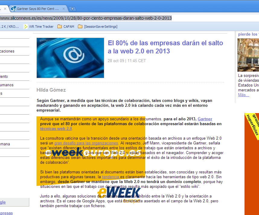
The end of the "document" age

The prediction
Gartner is predicting the end of the "document" age. Finally!
I'm waiting for this to happen since years ago.
They say "Managing Users' Transition from File-Orientation to Web 2.0 Approach Will Be a Major Challenge" while it should not be so.
The (painful?) transition
I imagine that Gartner interviewed people working in offices and asked them "What do you prefer, wiki-like or file-based documents?" and got honest answers biased by the prior experience of those who asked and those who answered.
Office is enough painful so that nobody wants to switch, not even to a free option like OpenOffice, after all that whining about its cost. This is so because nobody wants to go again through such a painful training experience. Remember having had an experience like this?
The choices
Both choices, Office and Wikis, are painful.
Office because of its ancient design that MS does not want to change because they are locked in because they have so many million users locked in, reluctant to open their wings and fly away because they are afraid of more pain.
Open your wings and fly away
Wikis are, well, wikis. Limited in their capabilities, providing almost a single format for everything, most of the times lacking WYSIWYG capabilities. Geeks can grok Wikis, just another simple language to master, but normal people does not: they have more interesting things to think about.
But change happens
Change happens, and very quickly when the conditions are met. See, for example, Gmail (It seems I always pull the same example!).
Honestly, when web mail was as it was before Gmail, if you were interviewed by Gartner about a choice between desktop email and webmail, what would you have answered? Yes, you would have chosen desktop mail, wholeheartedly.
But Gmail reared and you changed your mind, didn´t you?
So it's about Google Docs ...
Actually, no. Not at all.
Google Docs is a straight copy of the Office UI and thus is has many of the issues Office has.
It has two good points: it´s online and it's collaborative. Unlike Office + Sharepoint, for example, that define "collaboration" as successive offline solo steps.
And Docs has a lot of issues of their own. I will not blog any more about all those bloopers because I don't have that much free time, and I want to blog about positive ideas, but trust me that Docs deserves a sound revision.
So what?
In future posts I will clarify what´s wrong about the "documents" and will sketch my take on the Office replacement, the one that will work, adopted with viral frenzy. Like Gmail was


Friday, October 23, 2009

Making AJAX crawlable

There is a not-so-new slideset by Katharina Probst and Bruce Johnson (the GWT guy) about making AJAX crawlable, here: http://docs.google.com/present/view?id=dc75gmks_120cjkt2chf


It's short and interesting.

It's not only about AJAX but any dynamic web site who wants their pages indexed like, for example, a news site.

One way to have dynamic content indexed was to make the internal engine render all the possible pages in HTML and store them in a special directory, in a simplified format to avoid a traffic spike .

Now Probst and Johnson say that Web sites willing to be indexed should provide a server script that outputs all the data the site wants to be reached through.

For example a site about places can output a list of cities with additional relevant data, in a simple listing "internal page" (do crawlers index very long pages?)

This would be better that to run the server scripts to make it generate all the possible pages. But it might be a resources waste, as instead of many pages one could do with a simple, long, "internal page" sporting the keywords and other fixed data ony once, and a listing of the variable parts, pointing to the URL where the user would choose his selection. http://docs.google.com/present/view?id=dc75gmks_120cjkt2chf Web sites wanting to be indexed should provide a simple script that outputs all the data the site wants to be reached through.For example a site about places can output a list of cities, in a simple listing "internal page". In some cases it is possible to run the server scripts to make it generate all the possible pages. This might be a resources waste, as instead of many pages one could do with a simple, long, "internal page" sporting the keywords and other fixed data ony once, and a listing of the variable parts, pointing to the URL where the user would choose his selection. "

"All possible pages" sounds scary, but in most cases it's not. Obviously Google can't generate each and every page. But most other sites could. Even eBay, for example, which must be doing something like that. Each site has to do its math: number of unique "items" times number of characters per item pure content, devoid of all the surronding stuff like hundreds of links that make a page weighty. Disk drives are inexpensive.

I think about loading a special directory with barebones XML "bait" pages containing all the relevant data with appropriate URLs that the web server could redirect to the actual page for viewing. This way the bait pages could be designed to display better in the search results list, with more relevant abstracts.

And when I write "bait" I think of scams, sites luring users to click in search results that take them to different contents.

Actually, the site should design and store indexing raw data, linking text content with URLs, to feed the crawler. And ideally the site should ba abre to run it at the time that best fits them, like for example during the local night hours. As the indexes do not update so frequently, not in real time at least, choosing a time should not be an issue.

Sunday, October 18, 2009

No new posts

No new post. Many days ago I tried to sprout a new article, funny, revealing, but it was not possible.

I ran into problems, the kind of problems I blog about here, and it was impossible to come out with a post in a finite time lapse.

So I decided to blog about those problems and in doing so I ran into more issues.

The issues were difficult to describe so I recorded the screen action and after doing so I noticed that I didn't know how to publish video, er .., flash, because I recorded the screen with Debugmode's Wink that outputs a flash video.

The "Add Video" button does not know about flash, only AVI, MPEG, QuickTime, Real, and Windows Media.

So I delved into the docs that would help me to learn how to include a simple, small, animation into my new post but no luck.
So this no-post is about not posting because of the reasons I post about.
I googled about posting flash in blogger and nothing clear came out, only that I could upload the movie into youTube and embed it.
youTube refused to accept my swf but didn´t tell why.

Does anybody know how to do it? Now I suspect that youTube rejected my swf because it featured cht usual pause/run controls.

Thursday, January 17, 2008

Calendar and timezones

Today I registered myself for an event, a webcast about a technology (making Eclipse pulgins) that will happen in a few days so I want to enter it in my Google Calendar.

The event is slated for starting by January 22, 2008 at 9:00 am PST / 12:00 pm EST / 5:00 pm GMT.

As I'm not in USA the first two time tags are meaningless to me so I'm left with only the third one, namely "5:00 pm GMT". As I'm in Buenos Aires my time id "GMT - 2" during this summer so after some reasoning I think I have to add (or subtract?) 2 hours to the GMT time to get my local time. Or I can visit timeanddate.com and after a while look for Buenos Aires in the long places list to find out that the event will start at 3PM here.

Why didn't I use the timezone option in Google Calendar event details input form?

Well, it happens that there is no such option. Which I think it might be useful for people entering events that will happen somewhere else, for example one that is going to travel.

Actually the screenshot is only a quick and dirty mockup I made for this posting. Just an idea to be developed.

Tuesday, January 1, 2008

Posting is a pain

Posting in the Blogger UI is a pain, one posts struggling against the system instead of being helped by it.

The first noticeable bit is the working area. In my modest 1024x768 screen only 21% of the pixels are devoted to input text, the rest is mostly flat blank or dark blue. Few artifacts, this is good.

Hey, I paid for the whole screen, why should I want to use only 1/5 of it?

An example comes to mind: the visualization and edition of environment variables in Windows. It is done in fixed-size small windows that didn't make much sense in 640x480 screens and are ridiculous as of today's resolutions.

As I said, this is the first bit. There are so many! For example whilst editing HTML, newlines become line breaks instead of being handled as blank space. A newline in the HTML source is replaced by a ... hmm, I already struggled trying to show tags here ... lets try, newlines are illegally converted in <br> tags.

Ten pearls of wisdom

Yesterday a couple in Florida found a pearl in their dinner.

That´s nothing, in terms of economical value, when compared with this pearl of wisdom I found the day before. It´s a small excerpt from a book, see for yourself:

Top Ten Signs That Things Are Going Badly

  1. "Our Web site is intuitive and user-friendly."
  2. We need to start doing some usability tests before our launch next month."
  3. "We can use [XML/SOAP/ insert other buzzword technology] to fix that."
  4. "If you stop and think about how the interface works for a second, it makes complete sense."
  5. "How can our customers be so stupid? It's so obvious!"
  6. "Well, they should RTFM!"
  7. "We don't need to do any user testing. I'm a user, and I find it easy to use."
  8. "We'll just put an 'Under Construction' sign there."
  9. "Shrink the fonts more so that we can put more content at the top."
  10. "We need a splash screen."

Yes, since long ago I noticed that when a developer designing any piece of software says they were planning to build it "APB" (A prueba de bobos = fool proof) then that system is bound to failure.


What usually follows is "How can our customers be so stupid? It's so obvious!" and maybe the addition of some user-patronizing instructions.

But all these ten bits together! Understanding this might save the site much more value than that of the rare pink pearl.

The book, whick I recommend without having read it in full, is "The design of sites".

It´s not about graphical design the "surface design" but on functional design which accounts for 90% of a site´s usability.

Friday, December 7, 2007

How to learn to loathe usability reviews and stop worrying

An usability review is always about issues in the user interface of a system.
It's the contrary of raving about the web site or whatever, is pinpointing design errors.
In the programming world those unavoidable errors are called "bugs" and usually are fixed without blaming anybody.
This is fine, the whole team owning the bugs and fixing them happily.

One problem I frequently found with usability reports is that the author of the UI resists the reports sayings as if it were an attack, arguing forever.

But so are those reports ...

Tuesday, December 4, 2007

Downloading the GWT Example Programs

How to download GWT Example Projects


Adhering to the currently running GWT Conference I'm blogging about a small issue in the GWT site.


It happens that, after seeing the reasonably good demos, I wants to have the code in my PC.


download sample ... or not?It looks easy: there is a prominent link button closing the page content (see image) labeled "Download Source Code."


So I clicked the button and it took me to a page titled "Google Web Toolkit Downloads" contaning the GWT download offerings, which does not include the sample code I wanted. Only a "Download Google Web Toolkit" button.


I said to myself "It must be somewhere near here" and started looking around.


A "see our complete download list." link seemed the solution, but not: it contains lots of GWT versions including release candidates for version 1.0 (1.4 is current as I write this.)


Conclusion: not a single sample download, I verified that all five example projects led to the same page.


The bottom line


It happens that the examples are included in the GWT download. So it's right to take the user to the download page, but #~@%gggg!


Instead of the notorious "Download Source Code" it would have been better to write "The source code gets installed with GWT in subfolder x."


A bit on usability


Most usability issues are small and silly, the problem is when they are so many!